Defi neobank
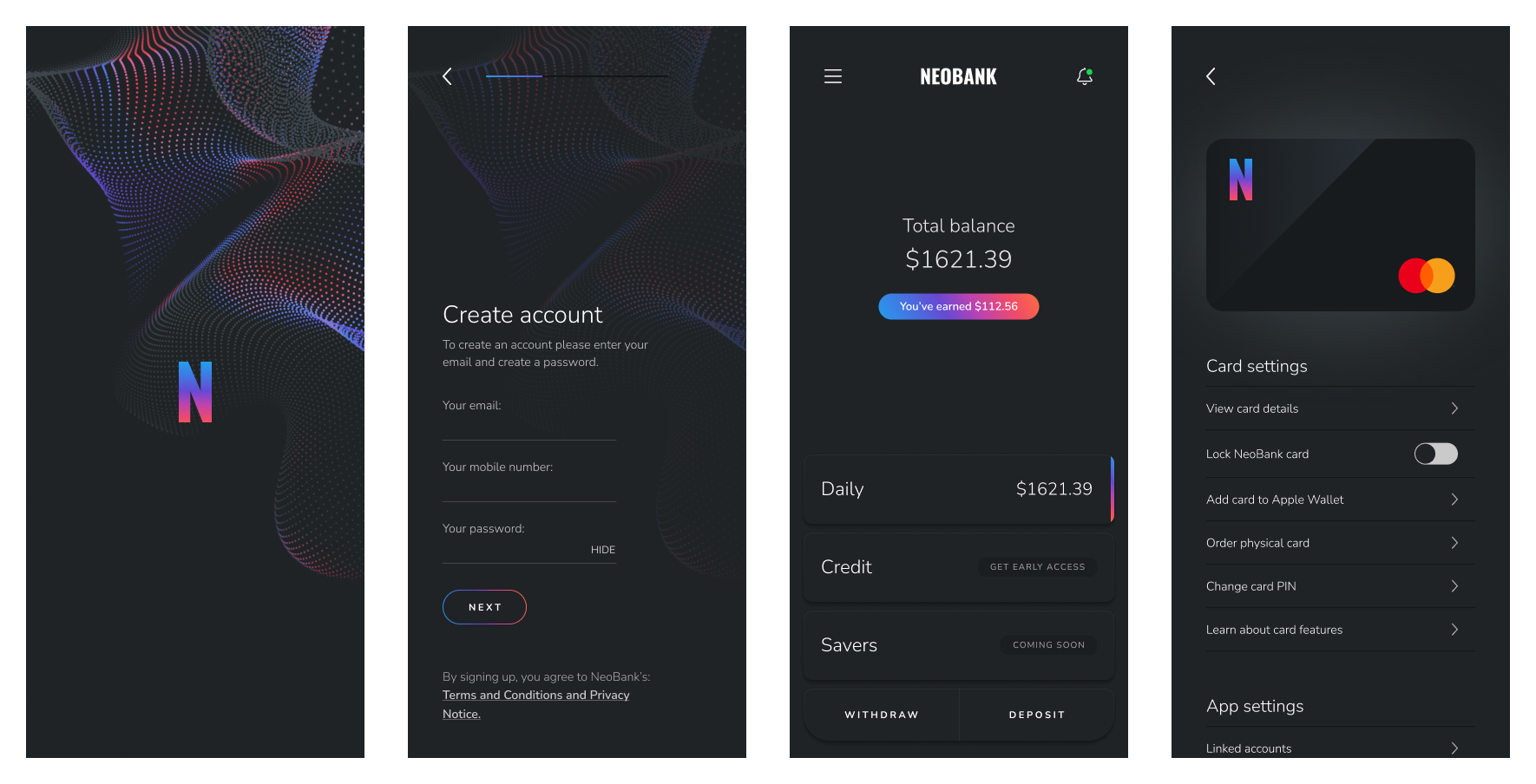
Note: I am not able to share the name of the startup for which this project was completed. All screens and assets have had the company name replaced with "NeoBank", and have had branding changed.
Background
I had been working with this neobank for an extended period of time on another project and app experience, unrelated to decentralised finance. With the late 2021 explosion of opportunity in defi and crypto, there was ongoing discussion among the team and founders involved as to how the great upside available could be brought to a wider audience, users who had little to no familiarity this space. This project was an effort to create a new mobile-first app experience which would both educate users on the benefits of defi and how it works, while also allowing them an easy on-ramp to invest in staked stablecoins to earn a reliable and relatively safe return.
The team
The design team on this project consisted of another designer and myself, both reporting to a senior designer who provided guidance and mentorship over both this and other projects. We also worked closely with a sizeable engineering team, a product lead, and the NeoBank's founders.
Establishing Product Architecture
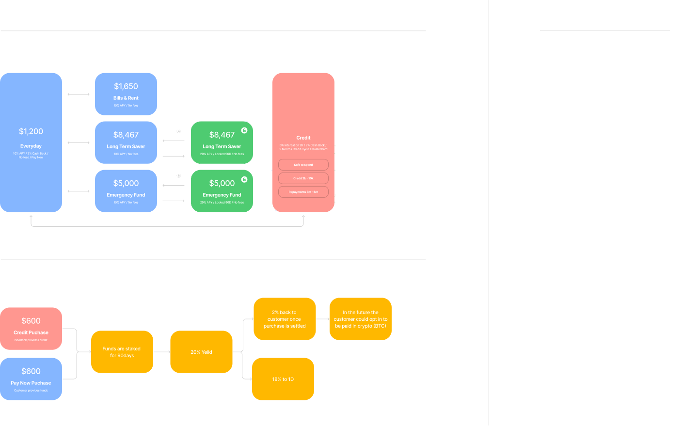
The project began by outlining the product architecture, in which the design team collaborated with the product lead and founders to establish which parts of the defi ecosystem the product would leverage to ensure reliable returns for users. The design team then created user flow diagrams and product architecture maps to create a single source of truth for the entire team to reference as the project progressed. During this process there was extensive learning involved, as I had not worked on or engaged with the defi ecosystem to a significant extent. One such diagram can be seen here:
User Personas
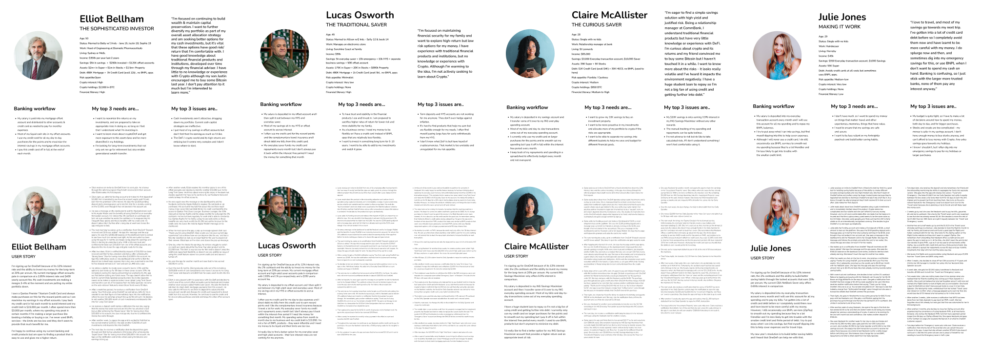
It was vital for the team to be aligned on the users which we were targeting with this product, and to this end the design team created a series of user personas and matching user stories. These are fictional individuals who represented the different user types who would be using the product. This gave us a clear directive when making decisions later in the design process, allowing the team to more easily align when there were many opinions on how design or development should progress.
Early Wireframing
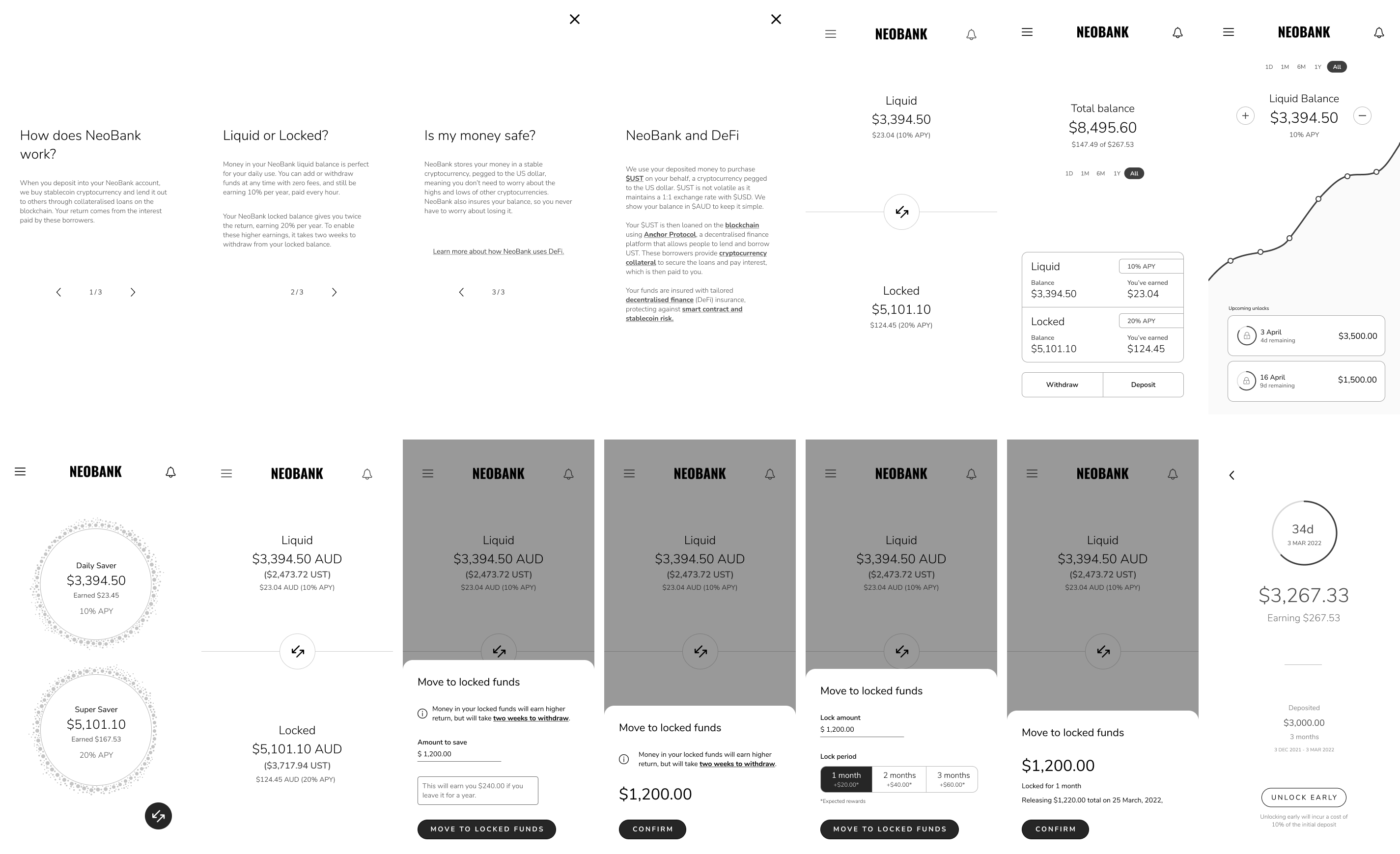
With a clearly established architecture and user stories, it was time to create initial wireframes to take to user testing. These wireframes were unbranded and black and white, making them relatively fast to create and enabling the team and testing participants to focus on the user experience and usability of the UI, rather than the brand. These wireframes leveraged some existing patterns of the previous NeoBank app to make them fast for the engineering team to implement, but were adjusted where necessary to create a streamlined defi experience.
Also included was initial mockups and copy for how education could work within the app, as we wanted to test early different ways of explaining the complexity of defi to new users.
User Testing
It was vital in this project to user test ideas and designs as early and often as possible. Across three rounds of user testing, the design team tested:
- Effectiveness of Educational content; Could our target users understand the complex systems present, and how can it be better conveyed?
- Understanding of the product proposition; Did users understand the benefits of using the product, and could they see it fitting into their daily lives?
- Ease of use of the designed interfaces; Could a user quickly and easily navigate the app screens to complete tasks and find information.
- Branding options; Of the many branding options presented by the design team, what appealed to users? What didn't?
This testing was integral to the ongoing design process, as feedback from potential users was the primary factor in making a large number of product decisions.
Testing was completed in online video call interviews, where a member of the design team would conduct the interview while the other took notes. Participants were carefully selected according to the established user profiles, ensuring that the feedback we were receiving came from users who we were targeting.
For each round of testing, we created an extensive script which was generally kept to during the interviews. This included background questions on our interviewee, interactive wireframes which they would engage with as though it was a real app, and follow up questions on the interactive experience.
All of our results were gathered and organised into large boards, an example of which can be seen here:
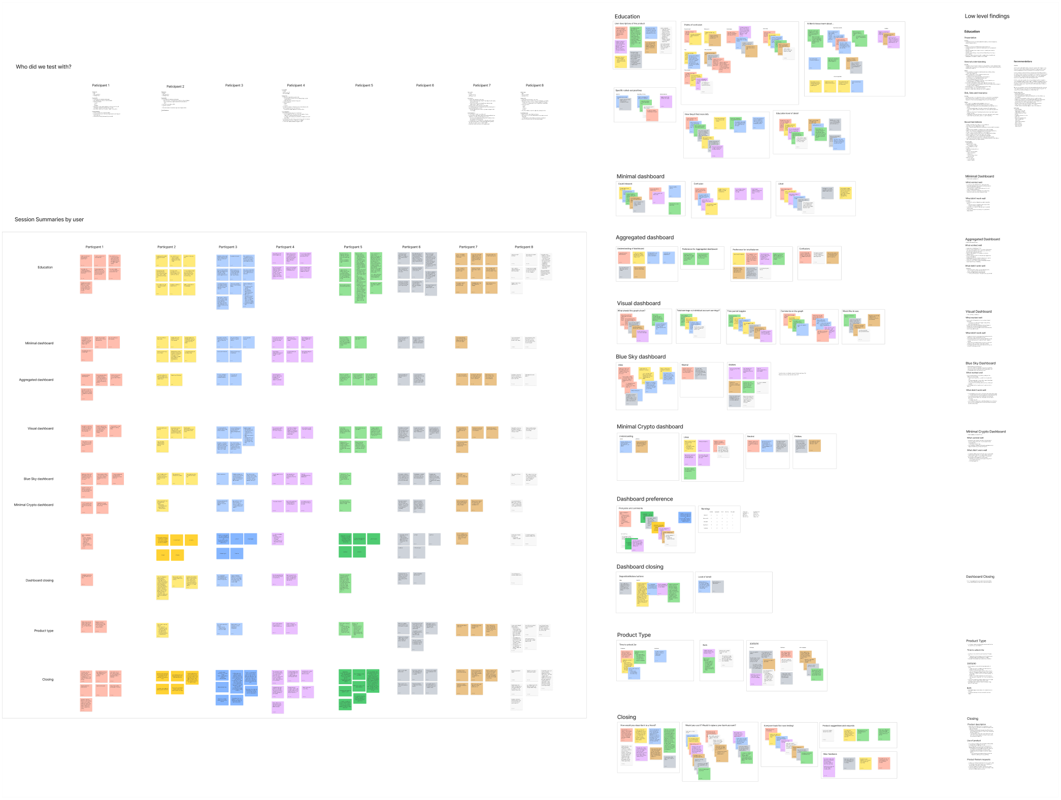
These boards were then collapsed into a presentation and a document format, for both presentation back to the wider team and future reference by us when making design and product descisions.
Branding
Being an entirely new product, this project had no existing branding to work with, and so all branding and brand assets had to be created from scratch. The process of creating a new brand was driven primarily by the feedback from user testing interviewees, and there was a back and forth of the design team creating new branding ideas and assets, getting feedback, and then refining. This resulted in a striking final brand, balancing the modern and high-tech themes commonly seen in the decentralised finance ecosystem, with the trustworthy reliable tones which traditional finance institutions leverage.
The decided focal element of the brand was the animated swirling flock of dots, acting as a recurring decorative element with some functional aspects within the app experience. I created this element procedurally in 3d software, allowing for a huge amount of variation and customisablitiy in how it looked and animated throughout the app, website, advertising material, and more.

Project Outcome
The design work on this project was extremely effective in pushing such a nascent product into a reality quickly. I am particularly proud of how the product testing and wireframing:
- Convertied numerous ambitious ideas in a new and exciting area of fianance into a concrete product which fit into the lives of those who would actually use it.
- Aligned the company founders and product team, helping the full team achieve clarity in an otherwise fast-moving and complicated industry.
- Created a flexible but recognisable brand identity, immediately cementing the brand in user's minds, but with room to grow as the product does.


