Positev

Background
The Positev startup aims to improve integration between the various discrete parts of the infrastructure involved in the rapidly growing electric vehicle market. Currently, car manufacturers, public EV charger providers, and home charging solutions exist on different networks, with communication between them limited. Positev is a foundational integration layer between all of these pieces, reducing cost and improving user experience for EV drivers.
Design Engagement
The two Positev founders come from an engineering background, and before looking for design input worked primarily on backend integrations of various aspects of the EV network, without any user-facing product. The first B2C component of the Positev vision was to create an app which integrated a parking booking and payment system with several different networks of EV chargers. This allows EV drivers to easily locate and reserve EV chargers, while also streamlining the parking payment system for non-EV drivers. My design input was required for:
- A light branding touch, to create an identity for Positev and the consumer-facing app.
- Strong user flows, focusing on simplicity in improving the current parking payment systems.
This project was very tightly-scoped, with only a single two-week sprint of design time and no budget for formalised user testing.
Brand Identity
There was no existing brand identity for Positev, and so branding was begun from scratch. From a moodboard of the branding and logos of related companies, the team decided that they wanted a lighthearted and bright identity and a combination logo, bringing together the company name with a pictoral mark to identify them.
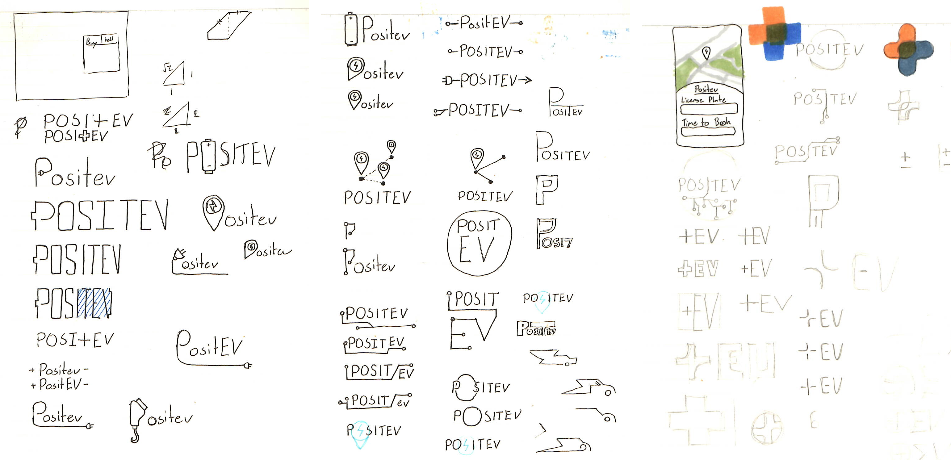
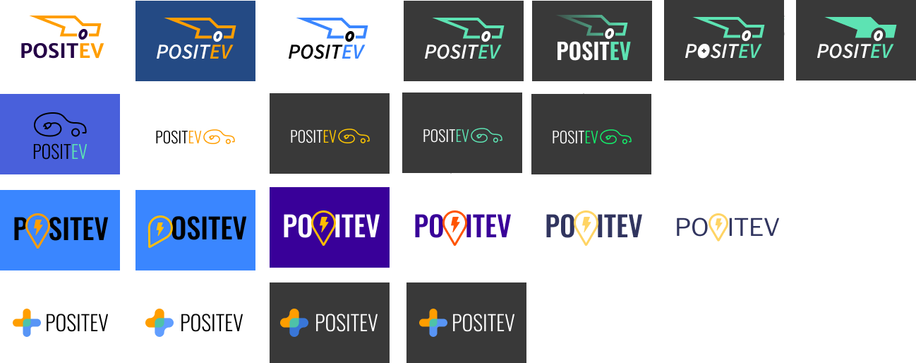
I created a series of logo sketches, and converted the team's favorite concepts to more refined digital versions:


The final decision by the founders was to move forward with the dark-mode background and green primary colour, combined with the pictoral mark of the car and charge cable combination.

User Flows
The user flows were initially discussed in an exploration session with the founders. The key focus of these flows was to require minimal learning from the user. No user wants to spend mental energy learning to use a new parking system. From this exploration session I created three initial user flows.

Pre-paid or Post-paid?
The first two flows present two fundamentally different product models for how parking payment can work. In the first, a user pays for the time which they wish to park immediately after parking. In the second, a user pays for parking after returning to their car, based on the amount of time the car has been parked there. Each of these flows had benefits:
- Pre-paid parking before the parking period meant that a user only has to engage with the app once, when they initially park. Paying after returning to the car would instead require an initial engagement to confirm that they had parked in the location, and a second for payment at the end.
- Post-paid parking flows integrate paid EV chargers more easily, as the payment at the end can include the payment for the electricity used. A pre-paid system would have to have a second charger later for the power used. This is not a concern, however, if the chargers are either free to use or are paid based on time, rather than watts used.
- Post-paid verification added additional verification complications, as it is a requirement that the same user who signed into the parking space is the one conducting the sign out flow.
After discussion the team decided to move forward with the pre-paid flow as many EV chargers are free to use, avoiding the primary concern with a post-paid flow.
Moving to a Web-app
Initially the team was planning to create an installed mobile app which the users would interact with, as this would provide the benefit of saving user data more easily locally on their device. It was my recommendation, however, that they instead create a web-app accessed through the phone's browser. This had several benefits to the user experience:
- First-time users would not have to install an app to use the product, a significant hiccup to a streamlined onboarding flow.
- Users don't have an extra app on their phone, an annoyance to many customers.
The flows could then also be simplified to allow for no user accounts, as paying for parking would simply require the license plate and a payment to be made (and potentially one-time sms verification), avoiding the original reason for an installed native app.
The discussions of the presented user flows were positive, and I was to move forward with wireframe creation.
Wireframes and Interactive Prototype
Ideally, I would have created low-fidelity wireframes without branding at this point, to take to user testing for additional data on the functionality of the user flows and the interface. Due to the very short design timelines, however, I was to move forward with branded wireframes to provide some short-term design direction for the developers.


Project Outcome
This initial design sprint proved immensely valuable to the Positev startup, crucial in such an early stage of the project in two key ways:
- The outlining of clear user flows provided direction to the engineering team, allowing them to focus front-end development on a user-facing MVP which provides a great user expereince.
- The creation of a strong brand identity and appealing high-fidelity wireframes added an important layer of professionalism to the founder's pitch decks, helping to land funding quickly to continue development.


